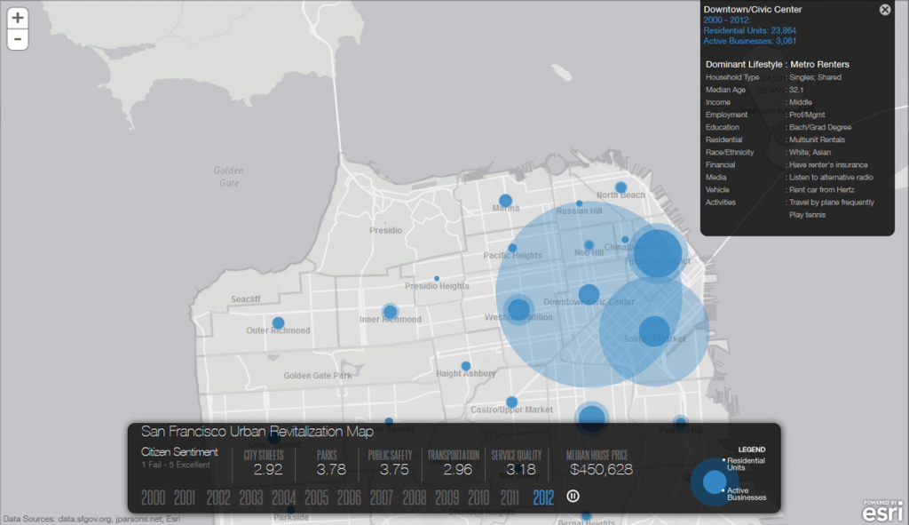
The San Francisco Urban Revitalization map, developed by Esri shows the last decade of growth and the change in neighborhoods. Esri collaborated with the city of San Francisco to create this animated map that tracks urban growth over the past 12 years.
The map uses some of the city’s enormous cache of open data to animate change in housing prices, residential and commercial uses and community sentiment over time. The tool uses a simple transition between years with a play/pause button, and includes an interesting dominant lifestyle section that is helpful in gauging the changing character of neighborhoods.
The result is an impressive visualization of the city’s explosive growth, and how it has affected different neighborhoods. Some of the changes are really dramatic; for example the drop of the housing prices after the recession around 2010 resulting in a construction boom in the downtown Civic Center area.