Timescapes

Timescapes is one of the finalists of the 2014 Innovation By Design Awards in the category of Data Visualization.

Four hundred years of New York History are compressed into a twenty-two minute presentation of morphing maps, images, and narration …

Timescapes

It’s an absorbing biography of the city, neatly organized into chapters that outline the city’s explosion out into its five boroughs, up into the skyscrapers, and down into the subway system. - The New Yorker, June 2005

Eviction Map of San Francisco since 1997

theAEMP-1024x591

The Anti-Eviction Mapping Project in San Francisco visualizes the locations of evictions caused by the use of the Ellis Act state law. The Ellis Act is a state law which says that landlords have the right to evict tenants in order to “go out of business”. All units in the building must be cleared of all tenants- no one can be singled out. Most often it is used to convert to condos or group-owned tenancy-in-common flats. Once a building becomes a condo it is exempt from Rent Control, regardless of the age of the building, and even if a unit owner subsequently rents to a long-term tenant.

Obviously, there is no limit to the number of times a building owner can “go out of business” (!) Because of the presence of Ellis Act law and as well as the landlords looking for ways to avoid renting to long-term tenants, the housing crisis in San Francisco will only be exacerbated.

This online map is a fascinating tool where we experience activist work and visualized information of evictions at the same time. The Anti-Eviction Mapping Project (AEMP) is a huge project which includes data from active surveys on eviction to the profiles of evicted tenants.

Visualizing San Francisco’s Urban Growth

SanFranciscoUrbanRevitalizationMap

The San Francisco Urban Revitalization map, developed by Esri shows the last decade of growth and the change in neighborhoods. Esri collaborated with the city of San Francisco to create this animated map that tracks urban growth over the past 12 years.

The map uses some of the city’s enormous cache of open data to animate change in housing prices, residential and commercial uses and community sentiment over time. The tool uses a simple transition between years with a play/pause button, and includes an interesting dominant lifestyle section that is helpful in gauging the changing character of neighborhoods.

The result is an impressive visualization of the city’s explosive growth, and how it has affected different neighborhoods. Some of the changes are really dramatic; for example the drop of the housing prices after the recession around 2010 resulting in a construction boom in the downtown Civic Center area.

Urban Renewal of New York in Time

The city transforms itself over and over in time. For the city of New York now it is possible to follow some of these changes:

urbanreviewer

Urban Reviewer is a comprehensive online map showing all the renewal plans for New York City. Additionally you can move the time slider in order to see the concentrated areas of urban renewal depending on the time it is adopted. The project team, 596 Acres, states that this project took two years to follow up on a Freedom of Information Law request for records of those plans and meticulous translation of paper plans into machine-readable spreadsheets to make the map.

These plans have existed in paper form in public renewal offices, but have been inaccessible to the public, until now.

Historical Maps of the Habsburg Empire

mapire

Mapire is an inspiring online map that enables the user to navigate through historical maps of the Habsburg empire. It includes different military surveys (first military survey (1764-1784), second military survey (1806-1869), third military survey (1869-1887)) and additionally the cadastral maps of Croatia and Hungary. This a great collection of antique maps where you can move around in the old times and compare it with today as well through Google Maps, Google Earth and OpenStreetMap built-in layers.

Here, you can watch the presentation in order to learn more about the process of Creating Mapire by a developer of Mapire.

Hi!

My name is Burcu and I am doing my PhD at the Vienna University of Technology at the Department of Spatial Planning with Professor Sibylla Zech.

The project Urban Change in Time (UCIT) is a part of my doctoral thesis “The Role of Visual Representations in Urban Planning” and it will be available as Open Source under the GNU GPLv3 license model.

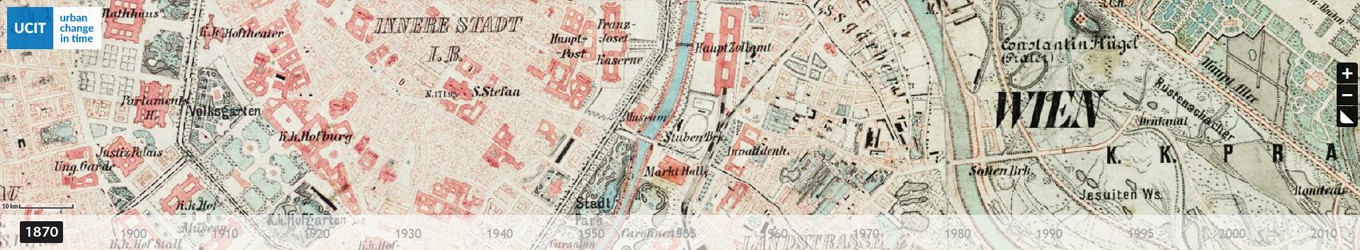
The project aims to create a web browser application which allows one to undertake a journey through time in Vienna or in Austria. The application allows the integration of geo-spatial information (maps) from past years till today into a web page where you can follow the transformation of the city with a simple time slider.

The general aim of this project is to make the geo-spatial information available for general use. For an effective “information culture” the approach to make information open, transparent in a rapid and easy manner is vital to the success of any academic and scientific institutions, students, public and private sector and most importantly for common people in order to empower them.

UCIT is now funded by the Internet Foundation Austria under the Netidee 2013 Funding Program and this blog is created in order to document the process and to disseminate the project. At the home page similar projects or the projects which have time perspective in it will be posted.

Greets,

burcu